Allergy Insider
Root Cause. Real Relief.

Overview
Allergy Insider is an educational platform developed by Thermo Fisher Scientific Allergy & Autoimmune, designed to bridge the gap between healthcare professionals and patients navigating allergic conditions. The platform delivers clear, accessible information on allergy symptoms, testing options, result interpretation, and common misconceptions—empowering users to better understand their health and take confident, informed steps toward diagnosis and care.
Our engagement spanned three interconnected work streams: a multi-channel Spring Campaign, a redesign of the "How to Get Tested" patient experience, and a broader website refresh. Each effort called for a careful balance of brand continuity and meaningful evolution, refining how the platform communicates without losing what made it familiar and trusted.

Our Process
We started by listening. We evaluated what was working, where users were losing confidence, and what each audience type actually needed. Allergy Insider serves both patients and healthcare professionals, so every decision had to hold up across two very different perspectives.
For the Spring Campaign, the strategic insight was straightforward: people were treating symptoms, not causes. That became the foundation for a multi-channel campaign designed to educate and redirect behavior towards a diagnosis.
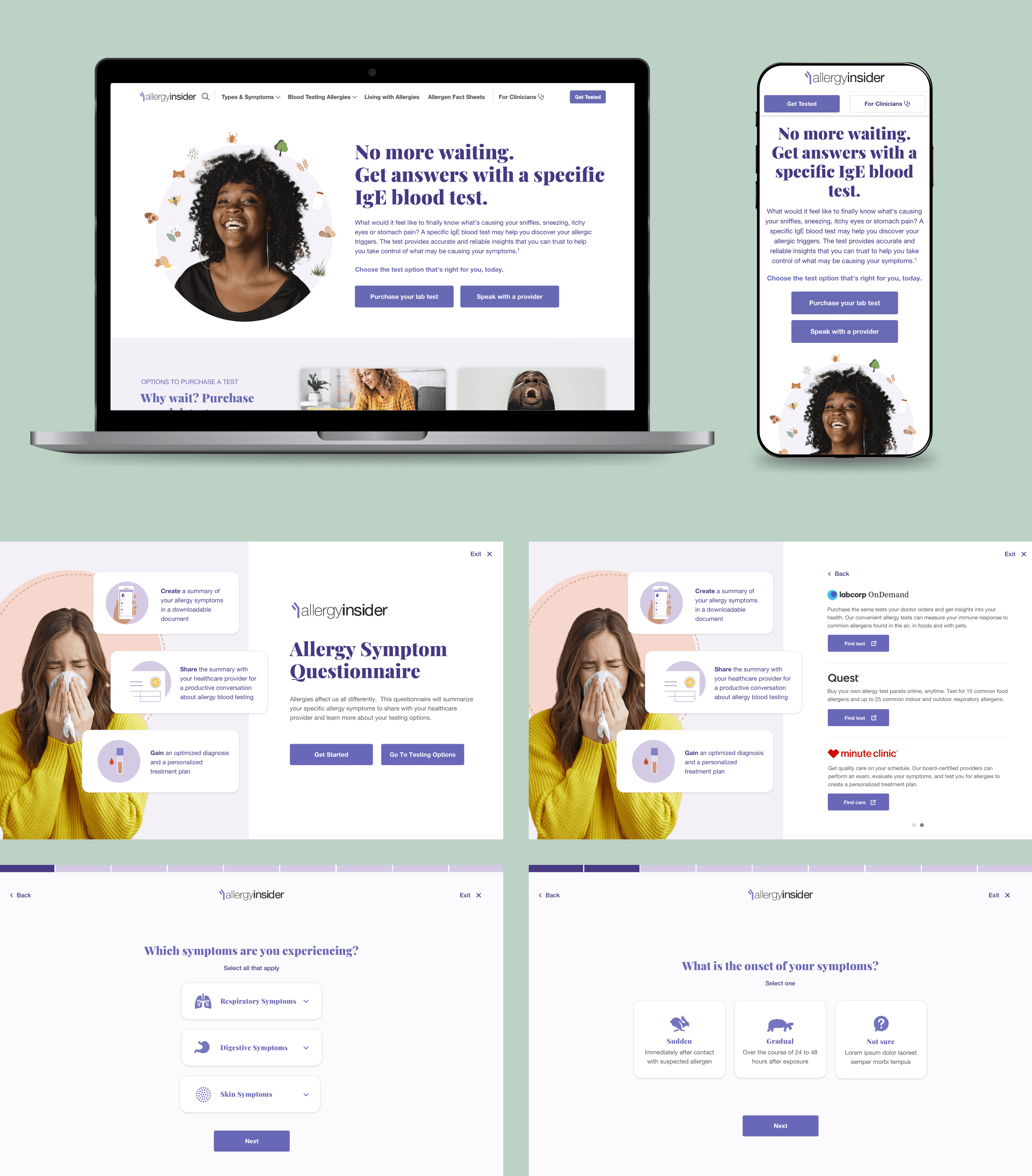
On the "How to Get Tested" experience, we simplified the UI, created a new UX structure by reducing friction, giving patients the clarity they needed to take action and walk into their next appointment better prepared to have a conversation with their doctor.
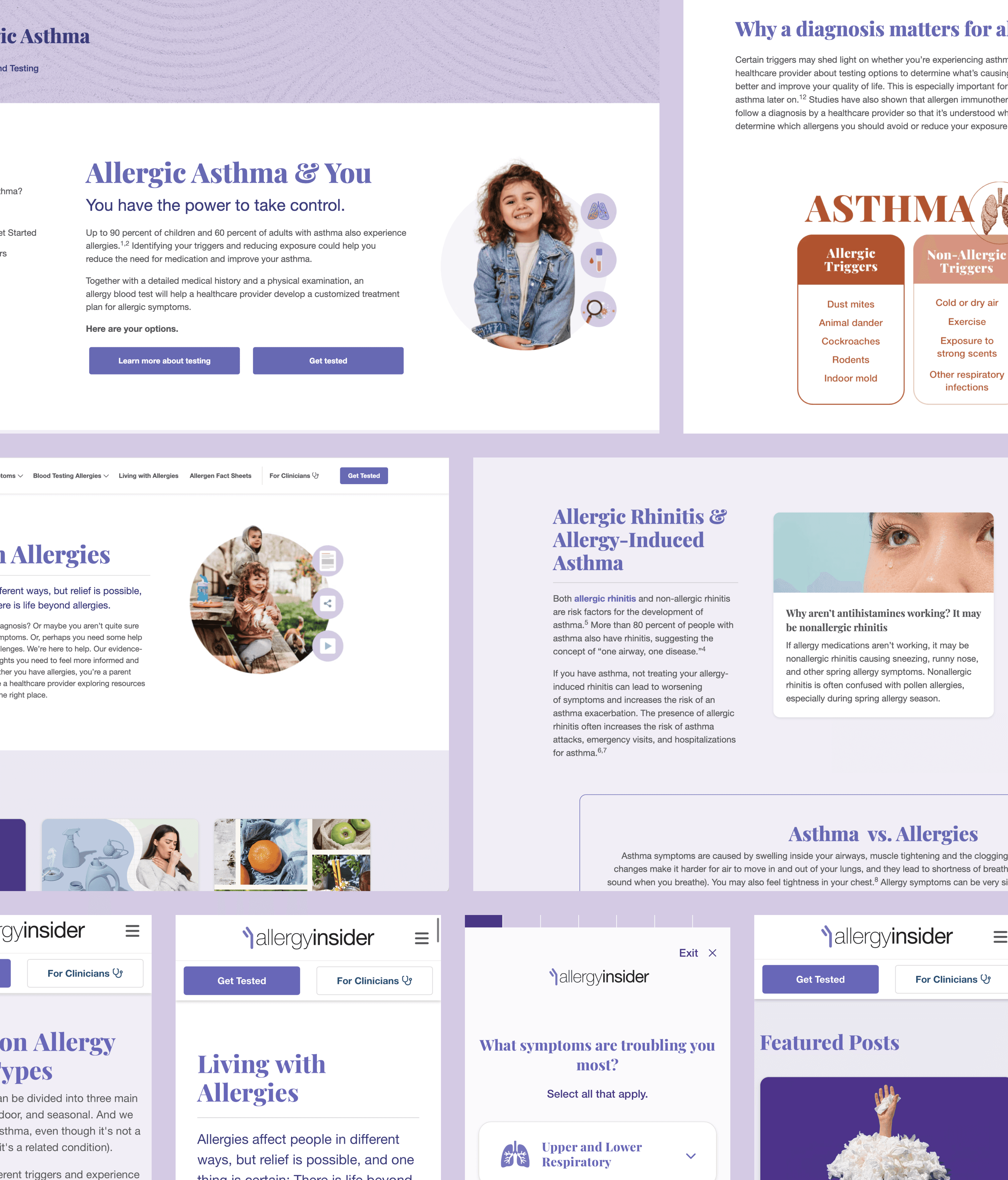
The website refresh required knowing what to change and what to leave alone. We modernized the experience by elevating existing components and tightening the user journey.
Throughout, strategy and design stayed in constant conversation—iterating together until the work felt both purposeful and clear.
Conclusion
Allergy Insider is a platform with real stakes. The people using it are navigating something complicated and personal, and that responsibility influenced every choice we made, from how the information is organized to how each interaction feels.
The result is an experience that’s more intuitive, more human, and easier to meet people where they are. By grounding the work in thoughtful strategy and paying close attention to the details, we helped make a trusted healthcare resource feel more accessible, more useful, and more in tune with the people who rely on it.
This work was conducted in partnership with Urban Emu.
Ideas are better when they're built together.
Echo + Form exists to partner—not just to produce. If your brand is ready to grow, sharpen, or find its form, let's start the conversation that gets it there.
GET IN TOUCH